Dirty Spokes 20th Anniversary
Idea
Mrs. Wardinkle and I run the Dirty Spokes trail runs. This is their 20th year, and to celebrate, I thought I’d create a card for it. The April 2024 card celebrated my return to running after a ten-year hiatus. Since returning, I have run every one of the series events (12-14 per year).
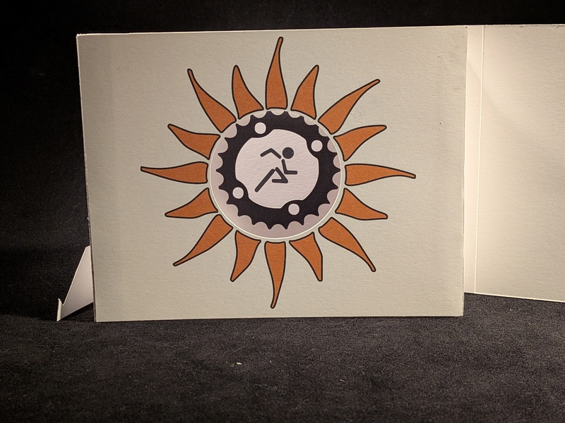
The logo for Dirty Spoke is pretty neat, which could make an interesting card.
![]() Dirty Spokes Logo
Dirty Spokes Logo
Design
With the three distinct sections of the logo, I thought a tunnel book (or peep show) mechanism would work. Such a mechanism has multiple layers that give depth to the card. In this case, there are only three, but the March 2014 card was a tunnel book with six layers. It was based on a photo of Roman ruins.
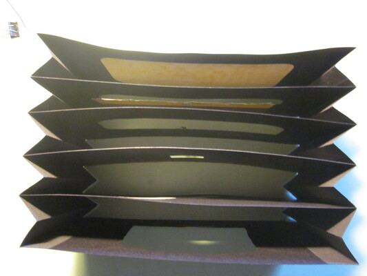
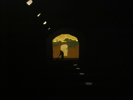 March 2014 tunnel book top and front views
The basic design of a tunnel book is like an accordion, with each layer attached to the wider parts of the pleats. The cut-outs in the layers get progressively smaller the deeper you go into the book, giving the effect of increased depth and perspective.
Here’s the top view showing the three layers of the tunnel book. (The pieces on the left and right make the cover.)
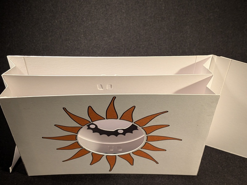 Top view showing the layers
A straight-on front view shows the layers, which look nearly flat in this photo.
 Front view
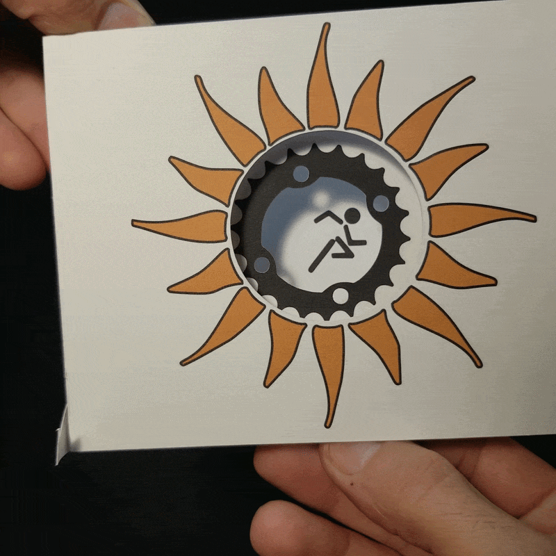
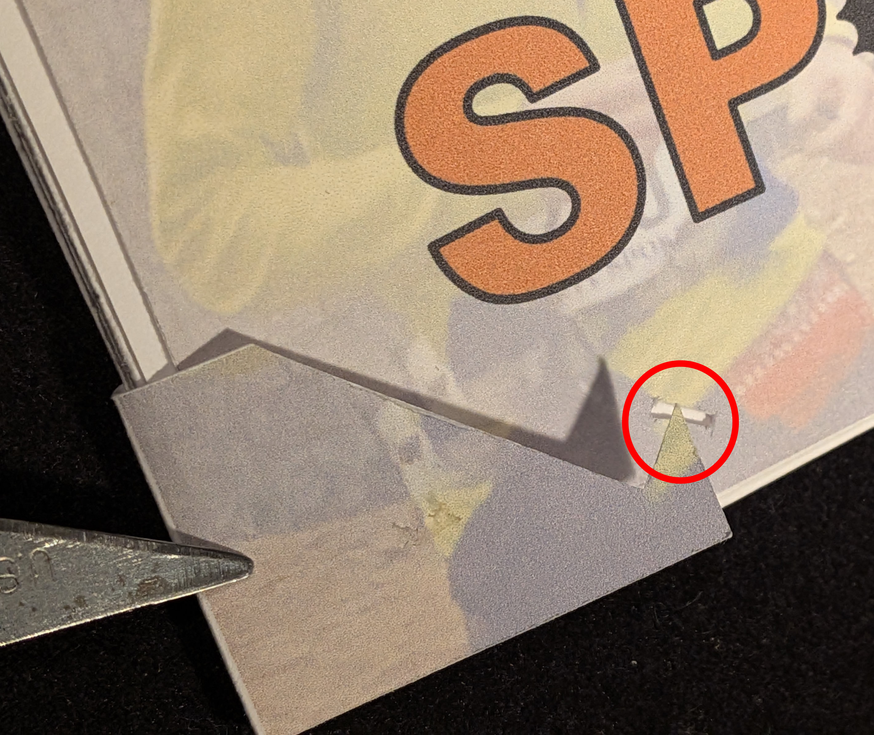
With fewer layers, this was much easier to build since there’s a front, back, and a single middle layer. Since it was so simple, I thought I’d make it a bit more interesting by allowing the gear in the middle layer to rotate. Usually, when things rotate in a pop-up, they do it on a center pivot, but in this case, the center is cut out. I thought that would be a problem, and it was. My solution was to create a circular slot in the gear piece with tabs that go through the slot.
My first try had four tabs that bent to the outside of the circular slot, which worked fine. Then I bent the card a bit, and the ring just popped right out. I added four additional tabs next to each of the original tabs, but bent them to the inside. That kept the gear from popping off. It rotates, but it would get stuck at a couple of points. I found that when gluing the paper ring down, if any glue was near the tabs, it would get stuck. In the final version, I made sure to keep the glue away from the tabs, and it rotates pretty well.
Here’s the sketch of the front of the gear layer with the tabs cut out and bent behind.
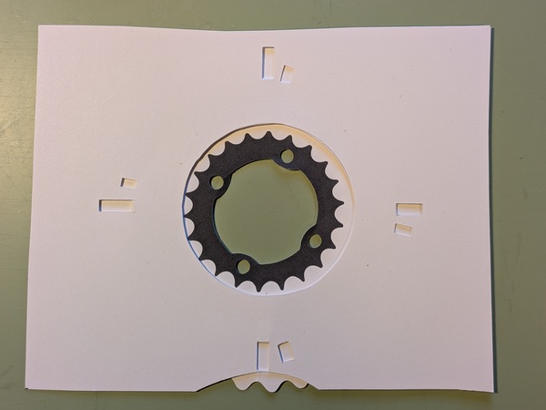 Front view of the gear layer
This photo shows the final sketch partially deconstructed to show the details. On the tabs on the right have one going outside the ring and one going inside. To make sure the tabs stayed in place, I glued a piece of paper over them, as you can see in the top and bottom tabs. Since the slot is circular, the gear and the outer ring that you turn are two separate pieces. To hook them together, I glued on a paper ring marked as “cover” in the photo (half is removed to show under it). The two glue lines helped me to avoid getting glue in areas that needed to slide under the tabs.
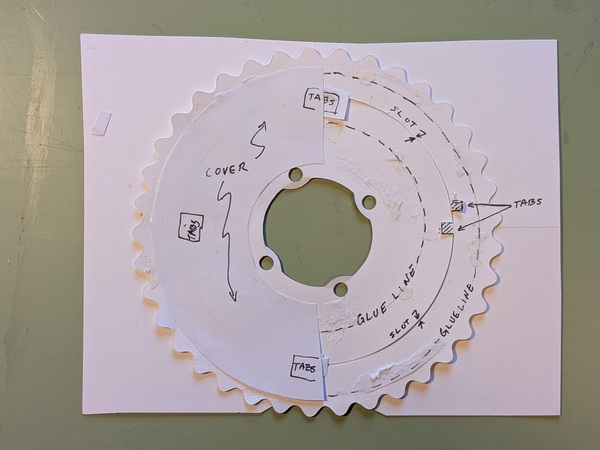 Details of the gear
Here’s the final sketch with the entire paper ring covering the back.
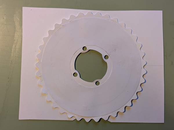 Bottom view showing the gear and tabs
Here’s a peek at the gear layer in the final version.
 Bottom view showing the gear and tabs
One issue with the accordion and rotating gear is that the accordion is very flexible left to right, which is the direction you push when rotating the gear. It works best when you hold the card by the middle layer and then rotate the gear. In the final version, I added another half-moon cut on the top to make turning it easier since it had some resistance. It’s not a great mechanism, but makes a simple card more complex.
Over the years, I’ve found that although complex cards are fun, they don’t necessarily make a good card. A well-designed card with a simple mechanism can be better than one with complex mechanisms.
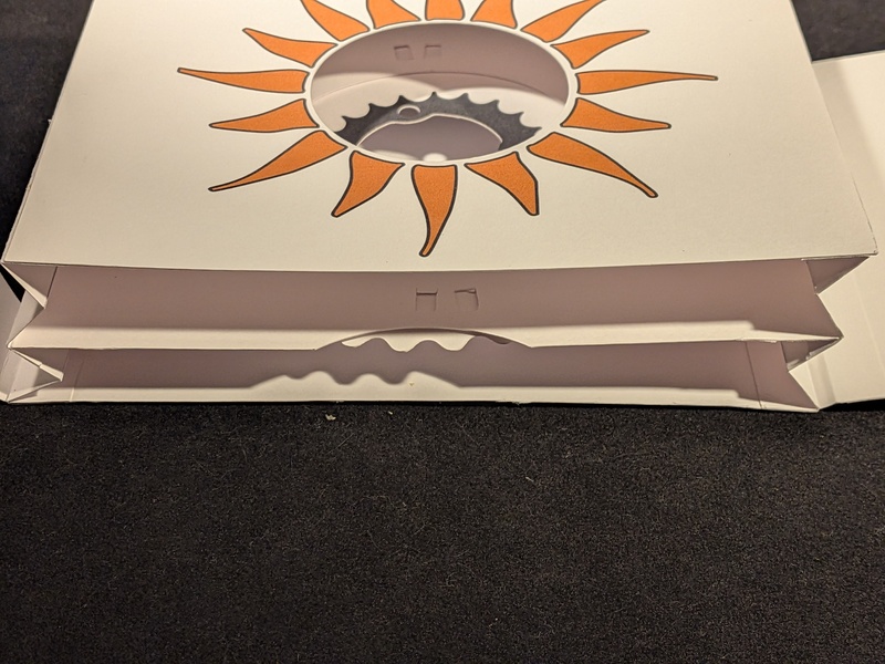
To finish off the tunnel book, a cover with a latch encloses and compresses it. The cover is attached to the right side, and the latch is on the left and hooks into a slot to close it. To keep it closed, a small latch is attached to the
 Latch
Latch
This “card” came out well, but isn’t one of my favorites due to the simplicity, and the less-than-smooth operation of the gear.
Cover

The printed cover uses parts of the logo in the text with photos of the Mrs. and me in the background. (Our faces are hidden to avoid calls from talent agents.)
Build
- 150mm x 120mm
- Most of the card is smooth Bristol paper since it is stiff.
- Index paper and printer paper were used in parts of the gear and the cover.
- Everything was printed out and cut by the Silhouette Cameo.