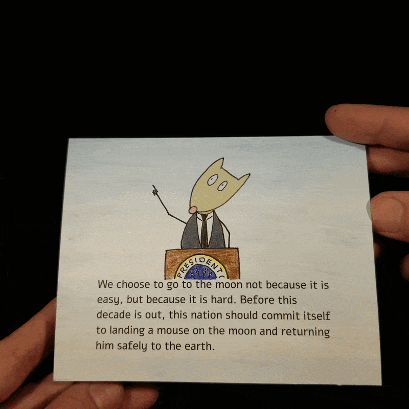
Before this decade is out…
Idea
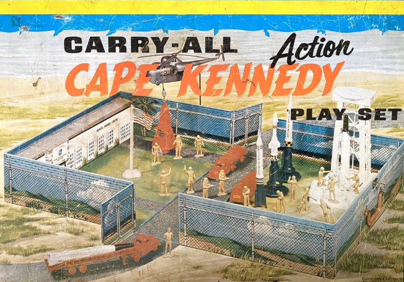
This is the first in a three-card series about the American space program from the 1960s. I grew up in that era and all the kids were wild about space. I had a space helmet (which later was converted into a snowman’s head for Halloween), and this metal suit case of space toys by Marx.
The era in which we live now is also exciting. There are two space stations — the International Space Station and Tiangong (the Chinese one) — and other countries and companies are sending landers to the Moon. There are multiple rovers on Mars. We’ve brought back samples from asteroids! My personal favorites are the two Voyager spacecrafts. They have been operating for nearly 50 years and are now about one light‑day away from Earth (over 15 billion miles, traveling at more than 69,000 miles per hour).
My only other space-related card was the April 2021 one featuring the latest Mars rover, Perseverance, and its helicopter, Ingenuity.
Design
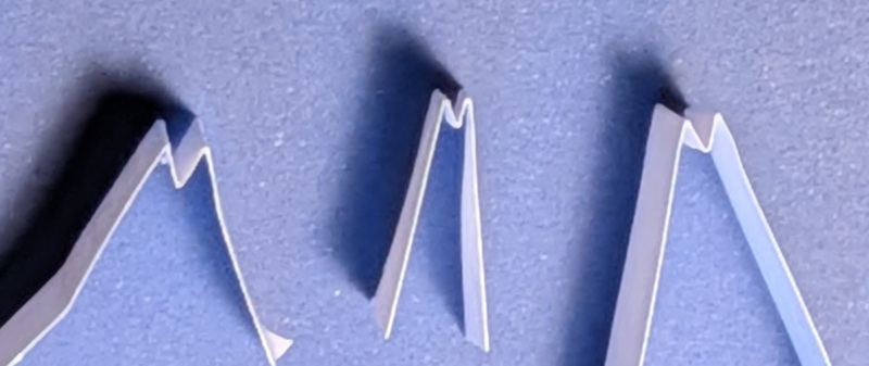
The design is a fairly simple one. The space capsule is a parallelogram. The banner at the top uses a new mechanism for me, the paper spring. This is some paper folded in a zig-zag pattern that will, hopefully, spring up when the card is opened. Here’s a little test I did to see which way the grain of the paper should go. The center one is against the grain and doesn’t spring up as well as the other two, which have folds parallel to the grain.
 The spring
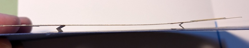
And here are the springs under the banner.
 The spring in action
The lower-left has a second pop-up with a rocket. The cover has the Project Mercury logo. The rocket is an acute-angle V-fold, about as large as I could make it. I was going to make the rockets in each card of the series to the same scale, but the Atlas rocket is only about one-third the size of the Saturn V. I tried paper and cardstock versions, but the paper opened better. I very lightly scored the main fold to reduce the stress and make it fully open.
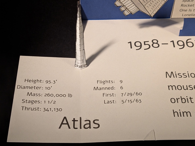 Rocket
As usual, V-folds that lift backwards should tilt slightly back. If it were configured to open vertically, it would tend to lean forward a bit.
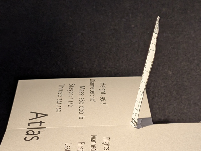 Tilting backwards
To hold the nested pop-up closed, I used the same method from the November 2025 card, which uses a small triangular tab.
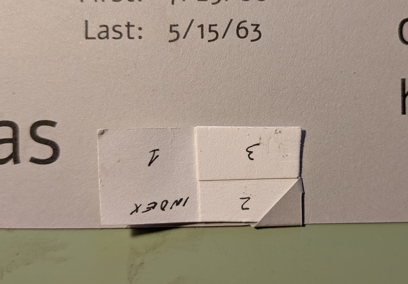 Setting the corner
It’s another nice card with some simple mechanisms. Since this is a series, you will see this repeated over the next two months.
Cover
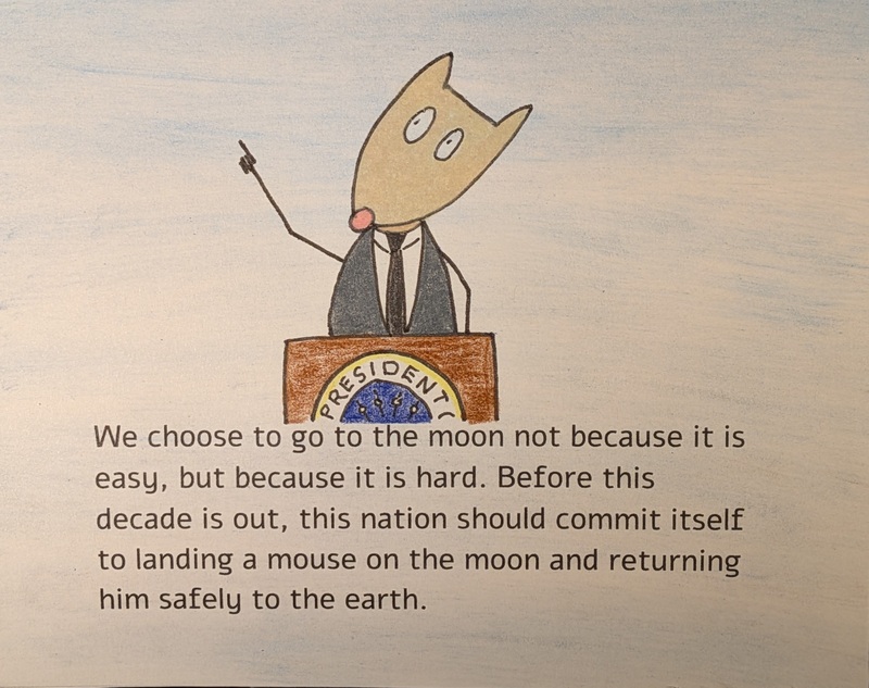
The printed cover uses pastels, printed text, and a hand-drawn mouse.
Build
- 150mm x 120mm
- The card has an index paper exterior with two layers of colored cardstock on the inside.
- Everything except the banner was cut by the Silhouette Cameo.