I’m a Loyal Fan
Idea
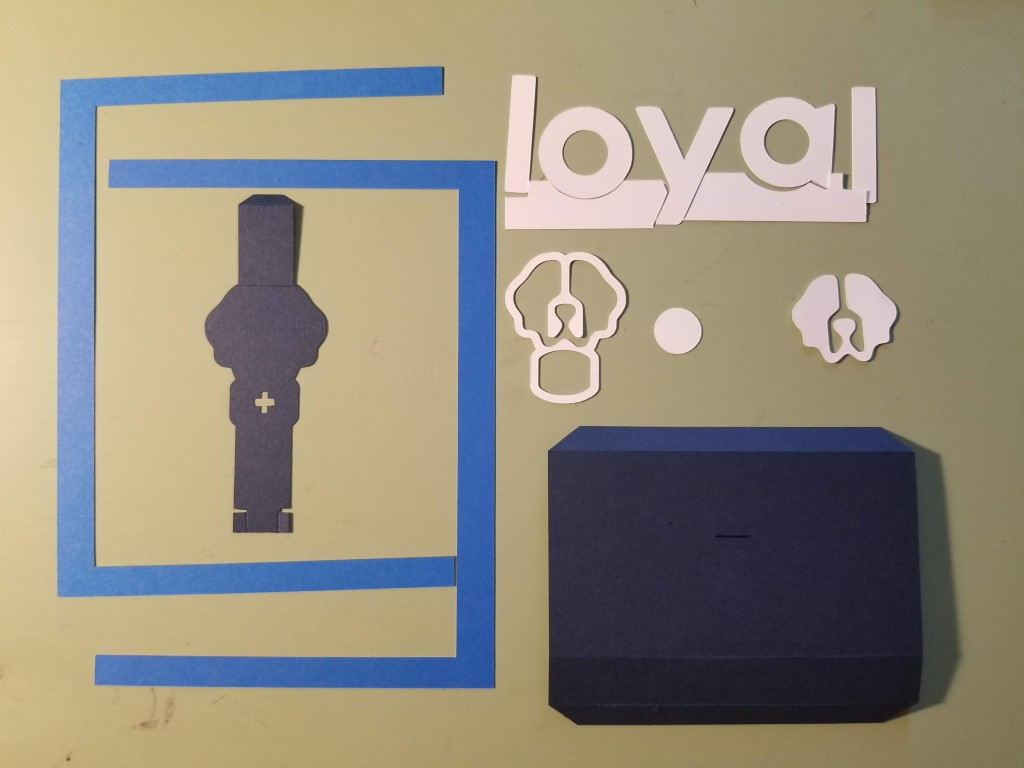
To celebrate the recent announcement of new colors and graphics for Loyal, I decided to make this month’s card with the new colors. The Loyal logo is a great graphic of a St Bernard logo and I’ve always wanted to do a pop-up of the logo, but never found a satisfactory mechanism for it. With the new colors, I decided to try again. For this card, I used the company’s name in its distinctive font and logo in the pop-up.
Design
I thought a neat design would be to sequentially raise each letter of the name as the card opened. That didn’t work out since the descender (lower part) on the letter “y” made two levels for the base of the characters. I ended up with a simple design with two parallelograms, one for the text and one for the logo. Being a simple design allows other people who may want to make the pop-up to use the same design.
As usual with pop-ups, the design must fit inside the card when closed. In this case, I had to ensure that the letters and logo stayed within the card as they move towards the long edge when the card is closed.
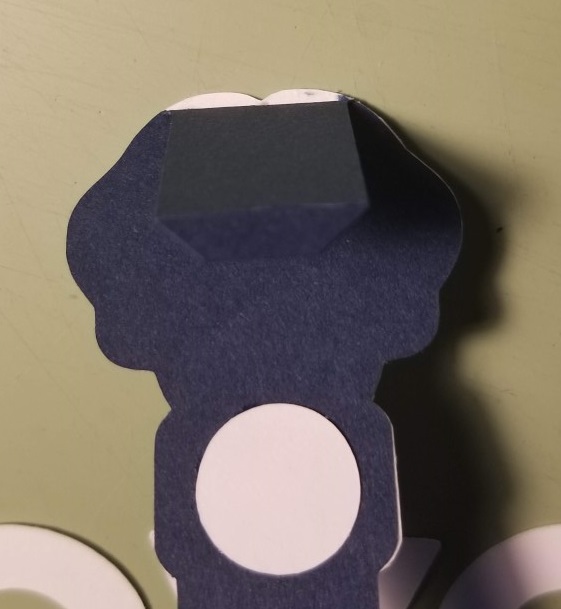
All parts of the mechanism were cut using the Silhouette Cameo. In addition to having the machine cut out the dark blue parts that make up the parallelograms, it also scored the fold lines with light cuts. Scoring made the folds perfect and makes the mechanism easier to open. For the logo, the dark blue part was cut to its shape to make aligning the white part on top of it easier. To avoid another fold, which adds resistance, I used a tab on the bottom of that piece to fit into the slot of the larger, dark blue parallelogram.
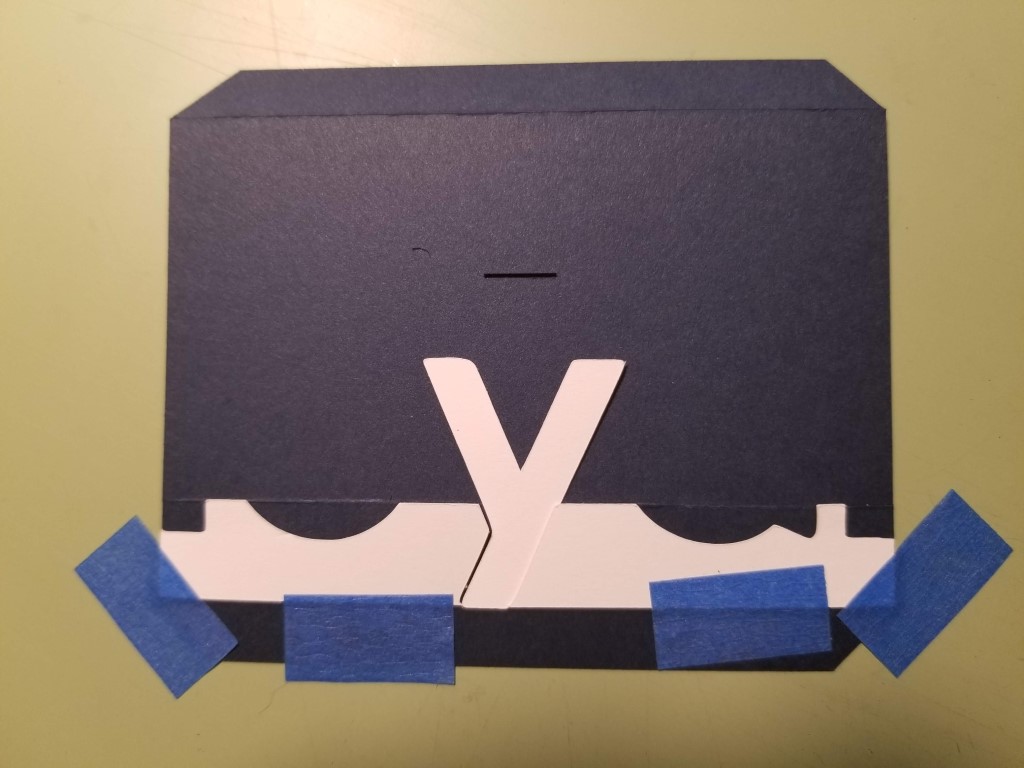
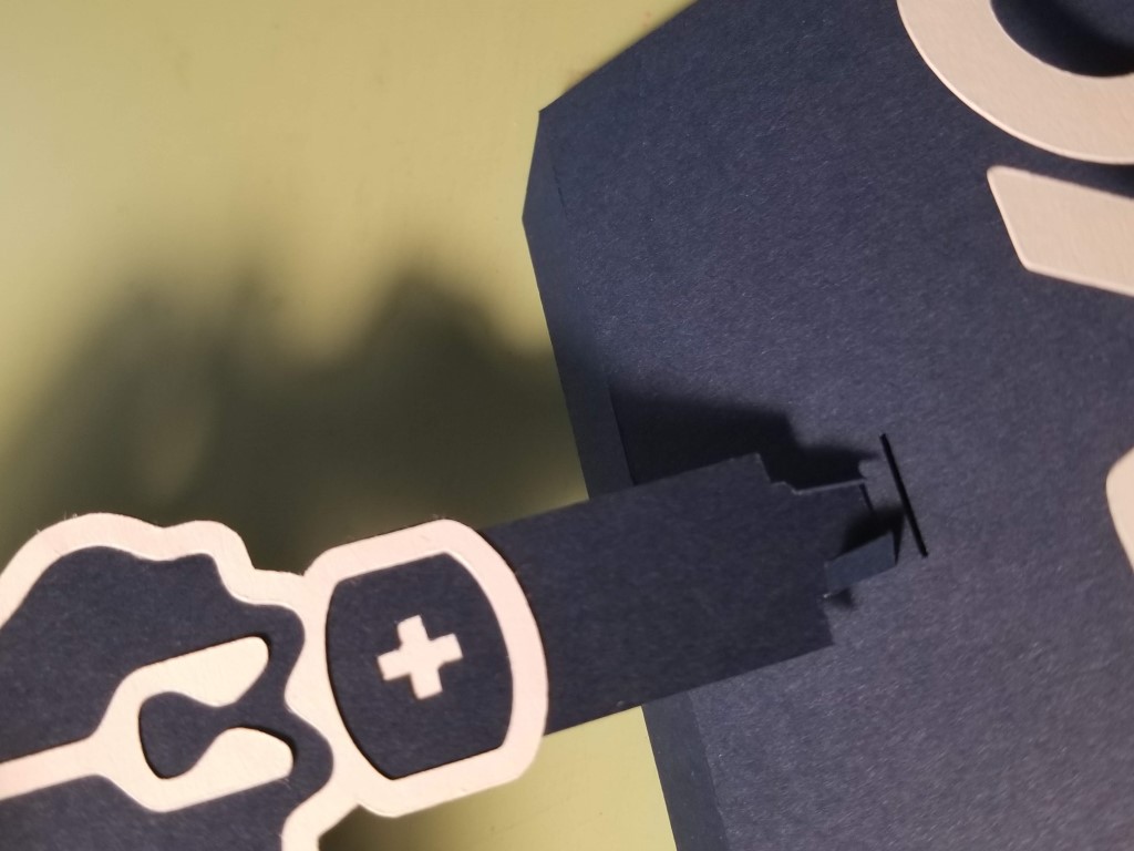
Each letter of the text was separate, so part of the design included a jig to align all of the letters on the parallelogram upon which they were attached. I taped the jig to the larger parallelogram, then starting with the “y”, I attached each letter. Below you can clearly see the slot cut for the logo’s mechanism and the horizontal scoring.
Assembling the logo was a matter of aligning the white part on top of the dark blue part. The white cross is actually cut out of the dark blue part and made white by gluing a piece of white card behind it. (I just used the inside of the ‘o’ for that.) That avoided having to try to align the tiny white cross on top but did make a bit of a shadow on it.
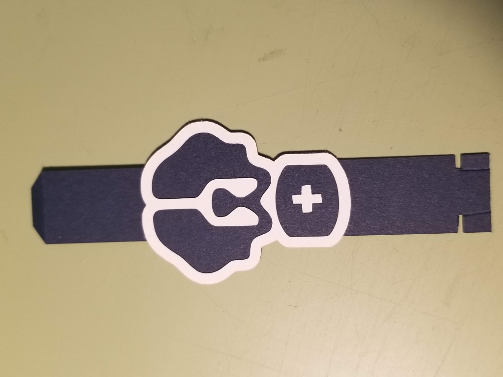
Since the top of the logo is not flat, the white part sticks up slightly above the fold to give it a better look appearance.
Before step before gluing onto the base is to insert the dog’s tab into the slot of the larger parallelogram. The sides of the tab are temporarily folded in to allow it to fit into the slot. Once inserted, the sides are folded out to lock it in place.
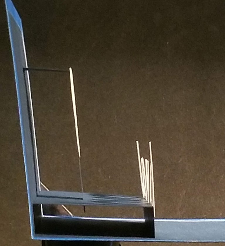
Assembling parallelograms is pretty simple. I take the length of the top of the larger parallelogram and transfer it to the base and glue it on. After that, it was just a matter of gluing the other tabs, and carefully closing the card to let it finds its own position. I say carefully since you only want the glued part in its final position, and as the card closes, you can accidentally touch the card, getting glue on it. The side view below shows the two parallelograms, and the tab sticking through the slot.
The final step was to add the bright blue border around the outside of the card. That blue is a pretty close match to the new blue. Then put it under a light weight for a few hours to keep it flat.
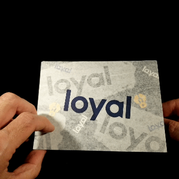
Cover
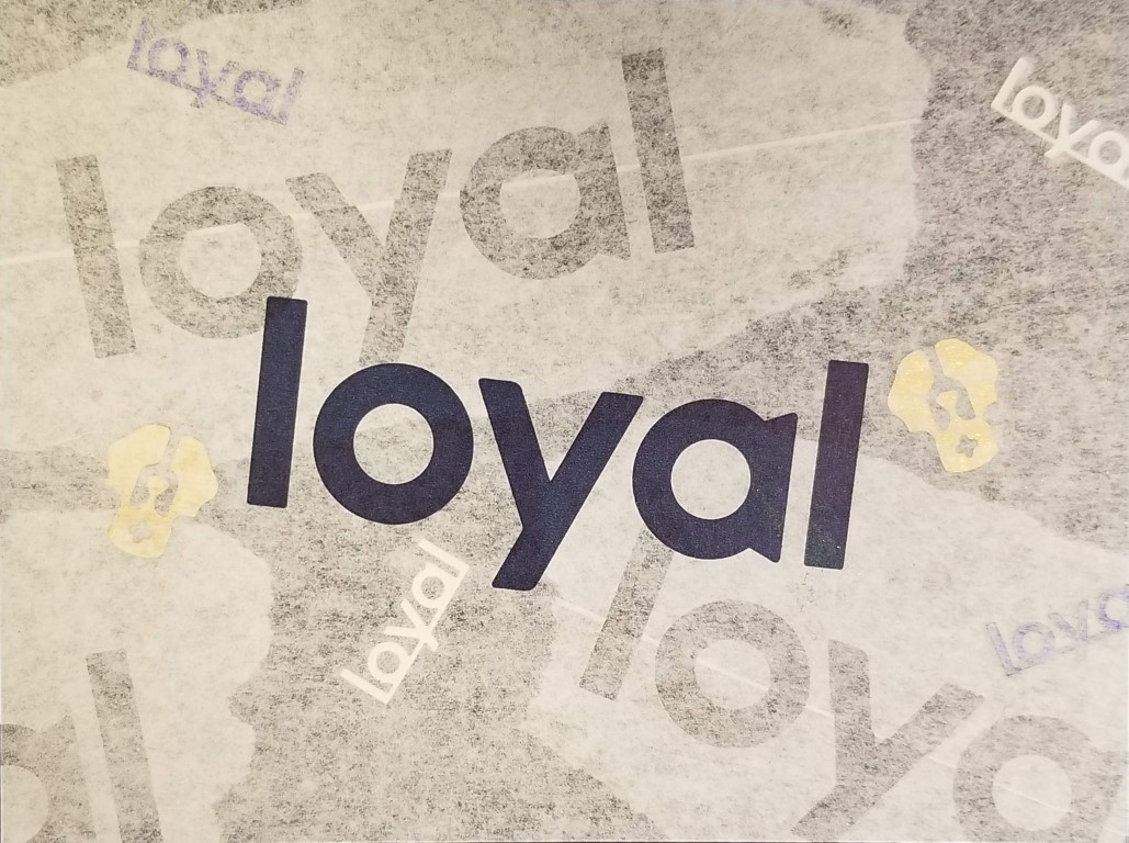
The cover is layers of Loyal tissue paper, with some Loyal-branded New Year’s confetti embedded in it.
Build
- 9” x 6”
- The blue parts are Michael’s Recollections cardstock, which is 176gsm, a bit lighter than I like for the base.
- The white parts are made from 199gsm index paper, which is a light cardstock.