Four (and a half) years of VT Pop-ups
Howard Jr. graduated from Virginia Tech this fall! It’s been quite a ride during the pandemic, but he has done it and we can’t be more proud of him. Every year during his college career I made a VT pop-up for his birthday, which is shortly after the start of the fall semester. This post covers all of them.
Freshman Year
Idea
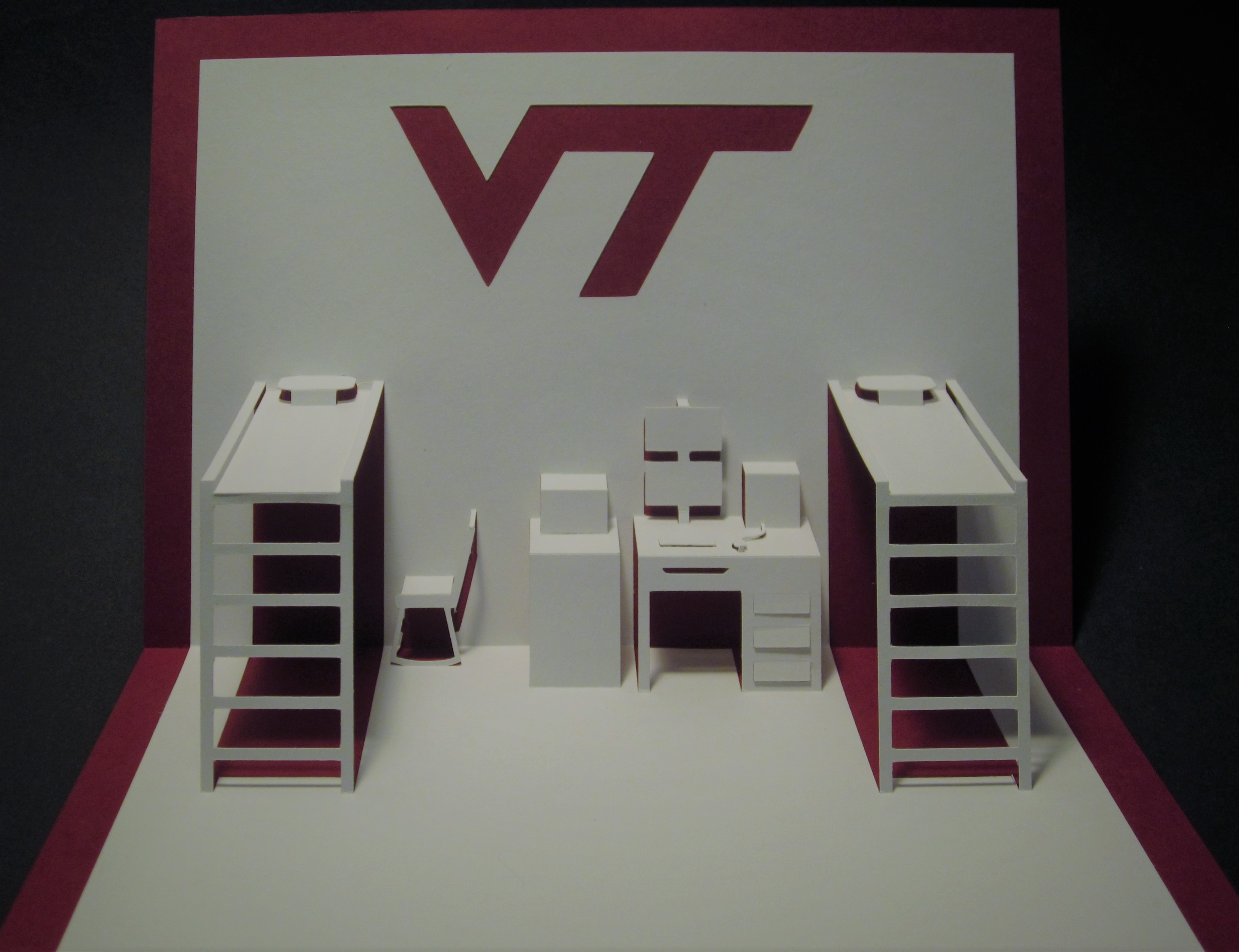
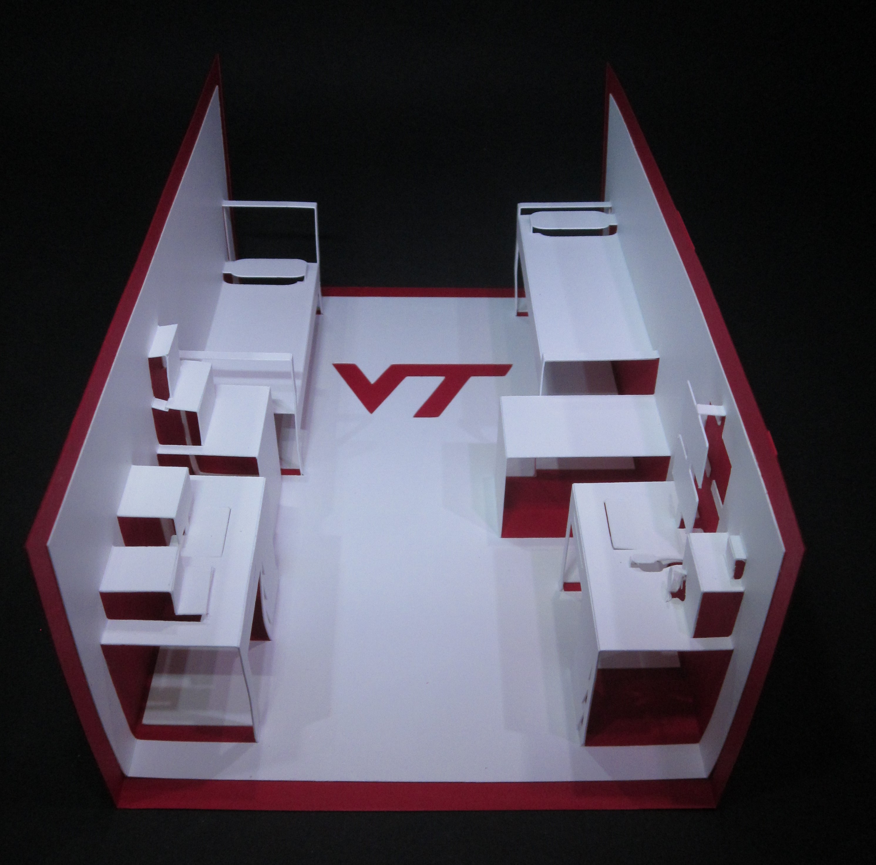
After moving him into his dorm room, I thought it’d be neat to create a pop-up of the room itself, which was a typical dorm room with two of everything. I modeled one side of the room. Both boys had their beds up high, with the left one having his desk under the bed, Howard Jr’s is the desk shown with the stacked monitors. To the left of the desk is the fridge/microwave.
Design
For this pop-up I used the origami architecture (OA) technique (a.k.a. Counter Folds BT5). I enjoy this technique since it is cut from one piece of paper with nothing glued on, so you have to do careful planning. In this case, since the beds are high, I can show nothing under them.
I always use the Silhouette Cameo when doing OA since it usually takes a couple passes to get everything folding exactly right. When designing OA cards, I use a 2mm grid since I’ve found that anything smaller tends to be too weak for a support and a grid is essential to get the layout exactly right. For non-structural details, sometimes I’ll go off the grid, like the mouse.
As with most OA, once cut out, it is a time consuming, careful process to get all the folds going the right direction and cleanly closing with the card. Scoring or debossing the folds is very helpful since the card will “want” to fold on those lines. For scoring, you score mountain folds on the front and valley on the back. For embossing, you reverse that embossing valley folds on the front and mountain folds on the back. If you score, you have to be very exact since the paper can split if you’re off a bit on the fold. Tweezers, and skewers are handy.
Sophomore Year
Idea
I didn’t rack my brain too much for a new idea and ended up with a theme! Yes, another OA dorm room pop-up.
Design
This time, I could model both sides of the room since each boy was set up on opposite walls. (Freshman year didn’t have much on the other side.) Howard Jr. is on the right (stacked monitors again).
Like last year, I used the origami architecture (OA) technique. By doing both sides of the room, I doubled my workload since this is really two pop-ups in one (All right, double prizes!). I did save some work by starting with last year’s design since the desk and beds were similar.
Junior Year
Idea
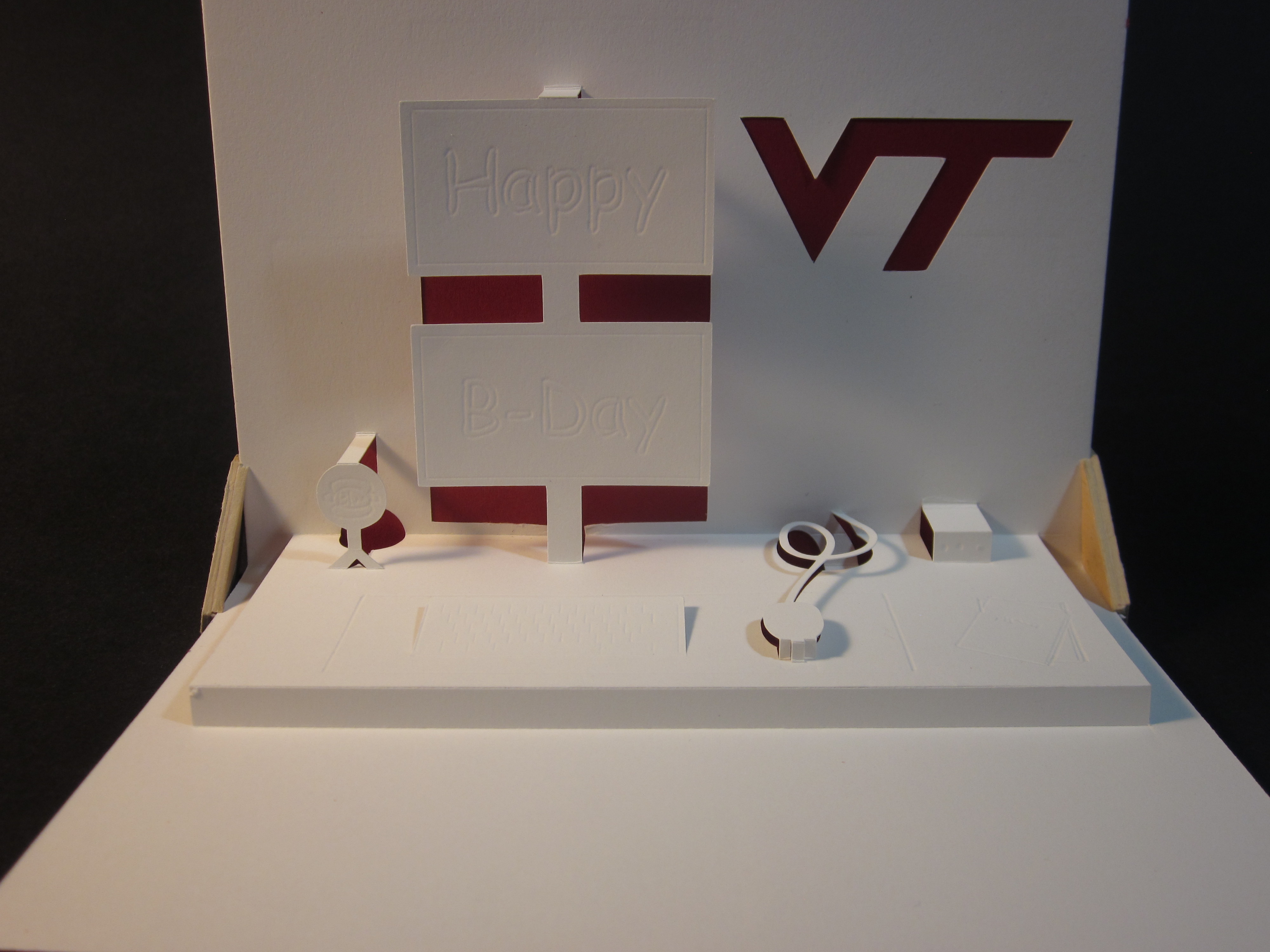
The theme continues. This year he was in an apartment and doing the room didn’t work, so I decided to just do the desk. It’s the desk you’ve seen in the previous years, just up-close and personal.
Design
YAOAPU (Yet Another OA Pop-Up). This is a bit simpler since fewer items are modeled, but with more detail. A new feature of this year’s pop-up is the debossing of text on the monitor, keyboard, and some papers on the lower right side of the desk.
Senior Year
Idea
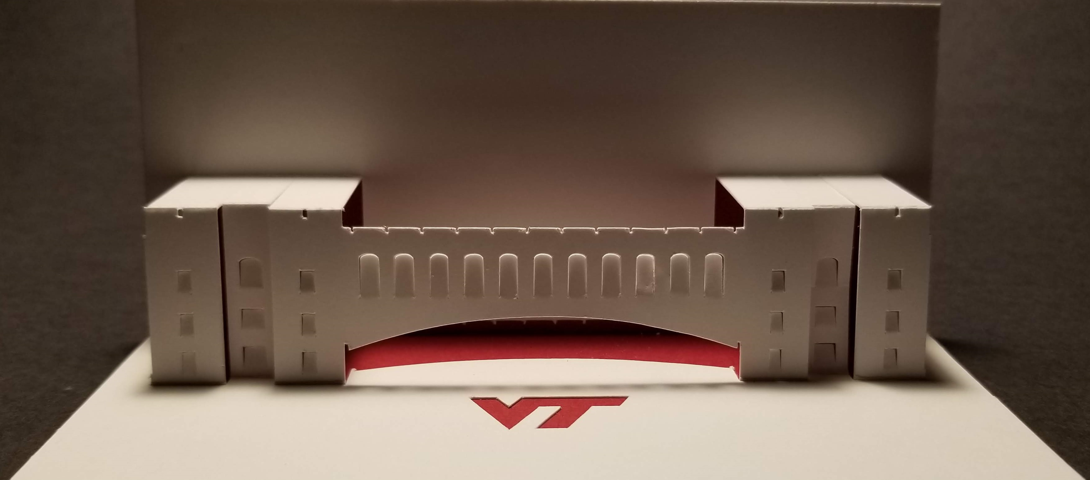
I broke the pattern this year since he was in the same apartment with the same arrangement. Instead of a room, I modeled one of the more recognizable VT buildings, Torgersen Hall.
Design
(Yes, YAOAPU). I always like doing OA buildings. As the term Origami Architecture suggests, this technique is often used to model buildings. There are many great examples, with Masahiro Chatani being the master. The books page has some reviews of some OA books I own.
I like the way this came out. For doing buildings like this I start with photos, and pull them into the Silhouette Cameo’s software and start tracing over them. You’ll notice that there are multiple levels, so the facade has to be split up in the pop-up, moving sections up or down on the page to create the offsets. As I mentioned before, I use a 2mm grid when laying out that really helps getting things lined up.
One thing I noticed afterwards are the unnecessary cuts on the rooftops.
Super Senior Year
Idea
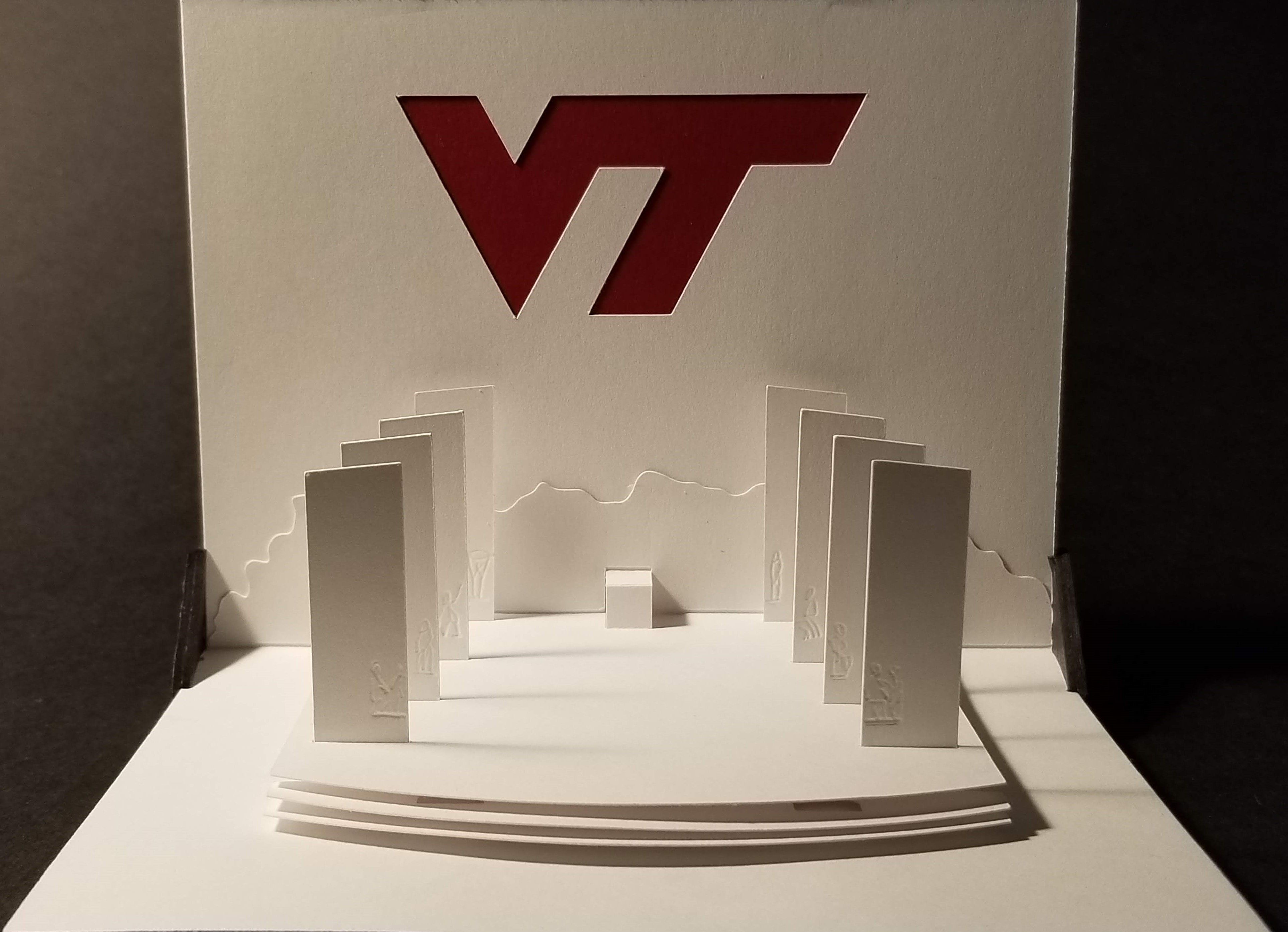
The pylons war memorial is perhaps the most iconic structure on the beautiful VT campus. It consists of two rows of four pylons honoring the VT alumni who have lost their lives in the line of duty.
On my first visit to the campus I thought it would make a good pop-up. Pop-ups can seem light, and fun, but in this case I had to make sure to be respectful of the subject matter. The cover simply had ut prosim in white on the dark red cover.
Design
I totally broke from all previous designs this year. No room, no OA. It would be possible to do OA, but since the pylons overlap quite a bit the final result would have a full pylon in the front and a thin ghost of the three behind it. Also the pylons tops would have to be attached to the back of the card, ruining the effect of the free-standing structures, not to mention the tops are not horizontal.
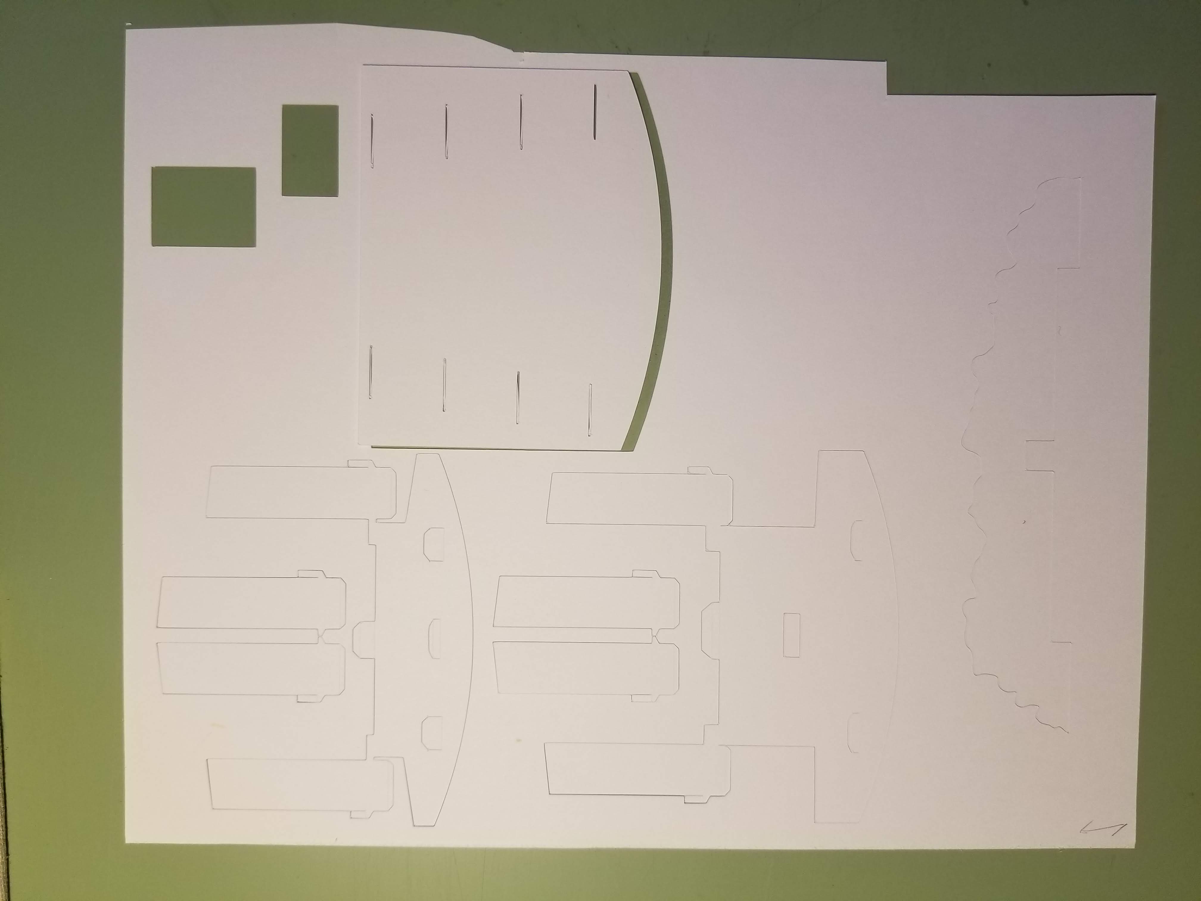
This was the most difficult design of the lot. The pylons must all stand up perfectly vertically, and be perfectly aligned. To do this the top layer, which is part of the back, has eight slots cut for the pylons with tight tolerances. Then another piece that has the exact same slot layout goes onto the base (that piece is on the right in the photo below). With the two layers with identical slots I could assure that the alignment was correct, and they would stand up vertically.
The lower two steps are attached to the first and second row of pylons. In the photo you can see tabs for attaching each step to the base and top layer as well as attaching the pylon to the bottom of the top. The lower step has a square cut out so the upper step’s support can attach to the base. The last two rows’ pylons are single pieces attached under the top, and onto the base. Did I mention it was a complicated assembly?
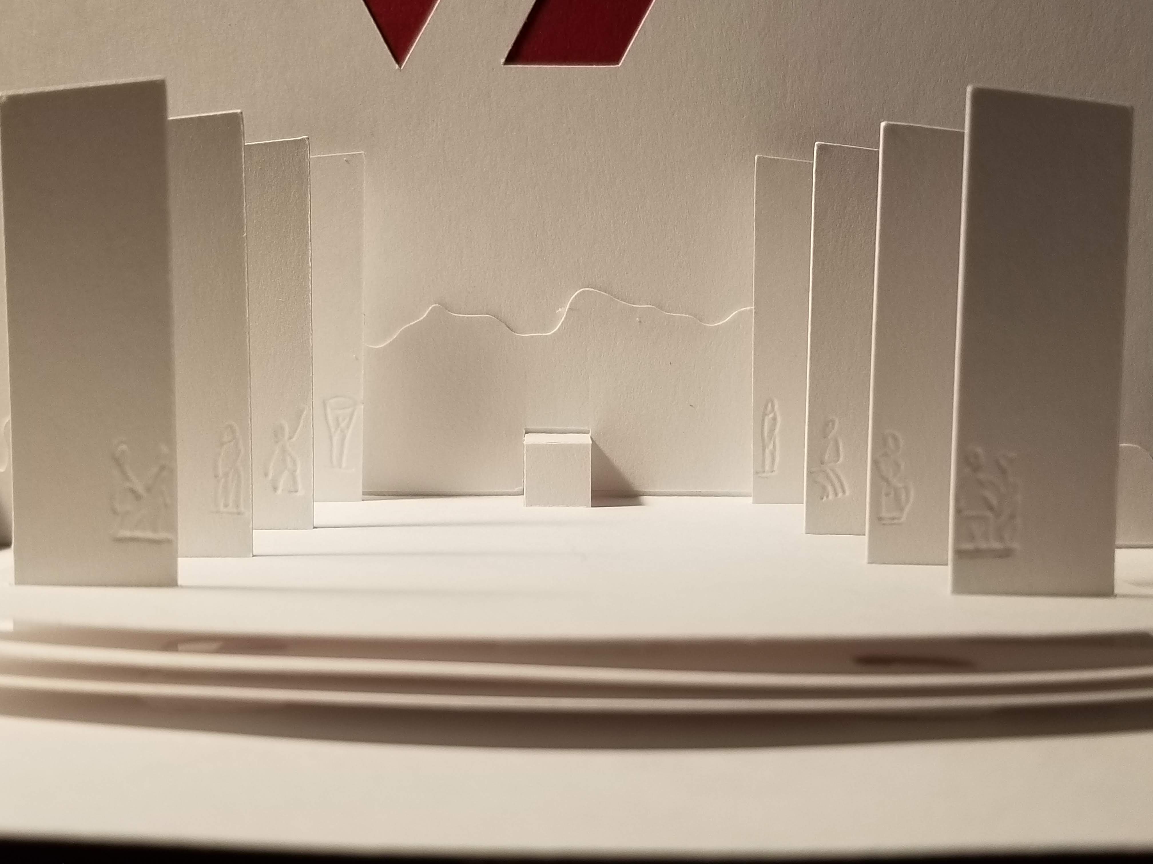
The photo above shows the debossing of each pylon’s sculpture. The outward tilt is an artifact of the close-up photo. They are vertical.
Graduation
Idea
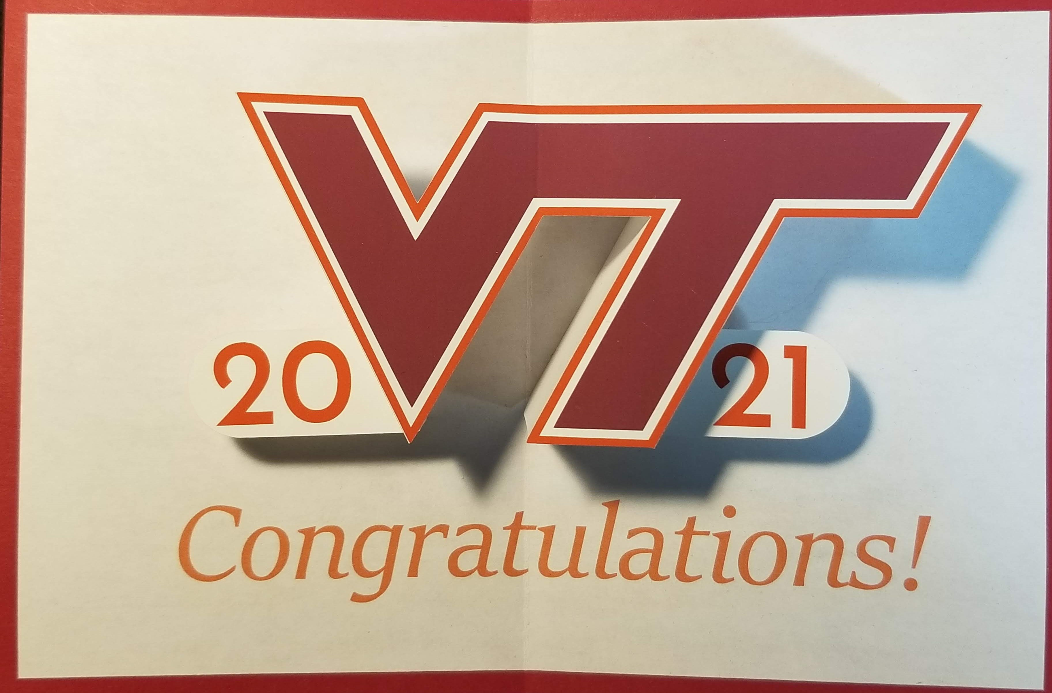
The last one is the series is the gif featured at the top of this post. For graduation cards, it seems like mortar boards, gowns, and scrolls encompasses the entire range of topics. I was going to do the hat, but it seemed too, well, old hat. So I decided on the VT logo and the year.
Design
Fortunately, the VT logo makes a V shape from the left side of the V with the right side of the T’s tail that is very close to the center of the logo. If you draw imaginary lines down from those, they will meet on the center fold right about under “Congratulations.” Once I figured that out, I could calculate out the maximum height I could make it, and still have it fit within the card when folded flat (a constant concern for pop-ups). The upper-right part of the T was the part to watch out for.
The base mechanism is a right-angle V fold (FS1) that is truncated, which means the point of the V isn’t part of the mechanism. On top of the V is a platform in the shape of the VT logo. The 20 and 21 are parallelograms (FS7) added to each side of the main mechanism (BT2). As the card closes the years will fold on the same angle and the V to which they are attached.
Builds
- Most are 9” x 6”, aside from the two buildings.
- All were cut on the Silhouette Cameo
- Most of the OA is Strathmore 300 Bristol 100lb, or Office Depot Bristol, which is a bit lighter. The graduation mechanism is on photo paper since my printer couldn’t get decent color on bristol paper.
- The dark-red base for most cards is Michael’s cardstock. The VT logo in all but graduation is created by cutting the logo from the mechanism to let the base card show through.